Over the next couple of chapters, we're going to build up a simple web-template. We are going to make a complete web-page from start to finish, that we can then repicate later on in order to create the actual web-pages for the website itself. This template will never actually be published, we'll be keeping it in case we decide to add another web-page to our website later on.
So, I want you to create an empty folder on your computer, and call it "My Website". To do this in Windows, double click "my computer" on the desktop:
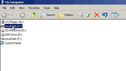
Then go into drive c, by double clicking on it:
Then click File > New > Folder
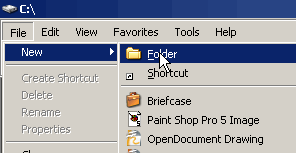
And name the folder "My Website". Then go into that folder (by double clicking on it).
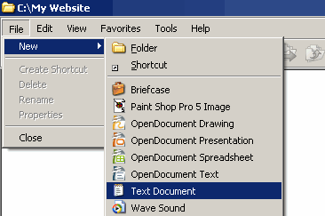
Inside the folder, create new, blank plain text document and it "template.html". To do this in Windows, click File > New > Text Document. The .htm part is very important, it tells the computer that this is an HTML file when you open it.
To view that file as a web-page, you just double click on it. To edit the file, right click on it, click open with, and then choose Notepad. You are now ready to start creating a website.
First thing's first, let's forget CSS for a few moments and go back to the complete HTML for a basic web-page that we looked at in an earlier chapter. Don't worry, you don't have to go and find it, it's right here as well.
		<html>

		 <head>

		  <title>My Design</title>

		 </head>

		 <body>

		  <div id="banner">

		   banner section

		  </div>

		  <div id="left-column">

		   left column

		  </div>

		  <div id="main-column">

		   main column

		  </div>

		  <div id="right-column">

		   right column

		  </div>

		  <div id="footer">

		   footer

		  </div>

		 </body>

		</html>
the above code was created based on the following design:
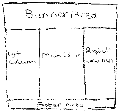
Adding Filler Text
We're going to be maniuplating the look of the above web-page using CSS over the next two chapters. So that we can get a better idea of what our website is going to look like, we should add filler text to it. This is made up content that we put into our template so we can get a good idea of how things are going to look when we create the actual pages. The main column will contain the page title (which we're going to use a <h1> element for here), and it will contain sub-headings and paragraphs. So the filler text for the main column will be:
		<h1>Page Title</h1>


		<h2>Sub-heading</h2>


		<p>

		 Filler text filler text I think that it would be a waste of the next few seconds
		 of your life to spend time reading this filler text. Though admittedly I did
		 spend time typing it!

		</p>


		<h2>Sub-heading</h2>


		<p>

		 Filler text filler text I think that it would be a waste of the next few seconds
		of your life to spend time reading this filler text. Though admittedly I did
		spend time typing it!

		</p>
We're going to be using the left and right columns for links, so for those we can just put something simple in like so:
		<h2>Links</h2>

		<ul>

		 <li><a href="template.html">Link</a></li>

		 <li><a href="template.html">Link</a></li>

		 <li><a href="template.html">Link</a></li>

		 <li><a href="template.html">Link</a></li>

		 <li><a href="template.html">Link</a></li>

		</ul>


		<ul>

		 <li><a href="template.html">Link</a></li>

		 <li><a href="template.html">Link</a></li>

		 <li><a href="template.html">Link</a></li>

		 <li><a href="template.html">Link</a></li>

		 <li><a href="template.html">Link</a></li>

		</ul>
Note how the links simply link straight back to the very template file we are working on. This is just for us really... so that if we click on one of the links (be it accidentally or just for the sake of it), it just reloads the page... as opposed to distracting us with another web-page or just crashing.
So, the HTML for the page will now look something like this:
		<html>

		 <head>

		  <title>My Design</title>

		 </head>

		 <body>

		  <div id="banner">

		   banner section

		  </div>

		  <div id="left-column">

		   <h2>Links</h2>

		   <ul>
               <li><a href="template.html">Link</a><li>

		    <li><a href="template.html">Link</a></li>

		    <li><a href="template.html">Link</a></li>

		    <li><a href="template.html">Link</a></li>

		    <li><a href="template.html">Link</a></li>

		   </ul>

		   <ul>

		    <li><a href="template.html">Link</a></li>

		    <li><a href="template.html">Link</a></li>

		    <li><a href="template.html">Link</a></li>

		    <li><a href="template.html">Link</a></li>

		    <li><a href="template.html">Link</a></li>

		   </ul>

		  </div>

		  <div id="main-column">

		   <h1>Page Title</h1>

		   <h2>Sub-heading</h2>

		   <p>

		    Filler text filler text I think that it would be a waste of the next few seconds
		of your life to spend time reading this filler text. Though admittedly I did
		spend time typing it!

		   </p>

		   <h2>Sub-heading</h2>

		   <p>

		    Filler text filler text I think that it would be a waste of the next few seconds
		of your life to spend time reading this filler text. Though admittedly I did
		spend time typing it!

		   </p>

		  </div>

		  <div id="right-column">

		   <h2>Links</h2>

		   <ul>

		    <li><a href="template.html">Link</a></li>

		    <li><a href="template.html">Link</a></li>

		    <li><a href="template.html">Link</a></li>

		    <li><a href="template.html">Link</a></li>

		    <li><a href="template.html">Link</a></li>

		   </ul>

		   <ul>

		    <li><a href="template.html">Link</a></li>

		    <li><a href="template.html">Link</a></li>

		    <li><a href="template.html">Link</a></li>

		    <li><a href="template.html">Link</a></li>

		    <li><a href="template.html">Link</a></li>

		   </ul>

		  </div>

		  <div id="footer">

		   footer

		  </div>

		 </body>

		</html>
Let's get on with it
So, we've already got both the desired design, and we have the HTML as well... So what's left? We start applying the CSS...
At the moment, our page has no CSS applied, which means it's going to look very boring. See the boringness, but notice how the page is still both readable and useable in this state? This is how the page will look if someone is using a very old browser, or a handheld device that doesn't support CSS.
So! Let's decide on a width for the web-page. You can have a web-page re-size to fit the browser window, this is done by using percentages for the width and height properties.
For this demonstration we're going to go for a fixed width of 800 pixels. We'll start at the top, and begin by styling the banner.
		#banner

		{

		 width: 800px;

		}
Now, if you need to recap on where the style information goes, refer to the chapter on including styles within your web-page. Any-who, we also want a border on the banner. In this case we'll go for a single pixel black border, so the above would change to:
		#banner

		{

		 width: 798px;

		 border: solid 1px rgb(0,0,0);

		}
Notice that I've changed the width from 800px to 798px? I've done this because the border is included in the overall width of the element. So the banner will now be 800 pixels wide in total, 798 pixels of which is the banner itself, and 2 pixels of which is border (1 pixel on each side). In terms of height, the banner will currently adjust it's height dependant on the content. At the moment the text inside the banner just says "banner section". This wont exceed the width of 800 pixels, and thus wont go over one line in height. This means that the banner will be one line of text in height, and will also have a border on the top and bottom.
The above is getting there, but it would be nice for the text inside the banner to be centered, and for there to be a decent gap between the banner's border and the text itself. We can get a decent gap on the left and right hand side just by centering the text, so for that we'll use text-align: center;. And for the top and bottom, we'll use some padding. We can specify padding using the em property, so we'll put half a line of text extra above and below the text in the banner.
		#banner

		{

		 width: 798px;

		 border: solid 1px rgb(0,0,0);

		 text-align: center;

		 padding-top: 0.5em;

		 padding-bottom: 0.5em;

		}
Now, the banner is coming along but it looks a bit plain, and the text doesn't really stand out. To sort this, let's make the text bigger and more stylish. We'll have... nice, red text, we'll have it bold, and just so that this section doesn't appear transparent, we'll apply a light cream background. So the updated code...
		#banner

		{

		 width: 798px;

		 border: solid 1px rgb(0,0,0);

		 text-align: center;

		 padding-top: 0.5em;

		 padding-bottom: 0.5em;

		 font-size: 2em;

		 font-weight: bold;

		 background: rgb(255 250 240);

		}
Remember, you can get a full range of colour codes to copy straight from my colour table. Remember to bookmark that page!
That's the banner done, what do we have next there... aha! Left column. Okay, we're going to go for similar styles as to make sure that the different parts of the web-page don't clash with each other. We'll make the overall width of this column... a quarter of the size of the banner, leaving three quarters room for the main column, and the right column. One quarter of 800 is 200, so that's our overall width. With the border, and some nice styles as well, we could have something like this:
		#left-column

		{

		 width: 198px;

		 border: solid 1px rgb(0,0,0);

		 background: rgb(255,250,245);

		}
The only issue here is, the content inside the column will now more or less be touching the edges of the column. It would be nice for there to be a bit of a gap between the text and the border, so for our columns we're going to add a bit of padding. In this case I'm going to apply 5 pixels of padding each side, which means there will be an extra 10 pixels of overall width added to the colum which we're going to need to take off. This might be a bit confusing, so consider this. The padding, width, margin and border added together produce the overall width of the element. So if we apply a 1px border to the element, there is going to be a pixel border on both sides of the element = 2px. We're also applying 5 pixels of padding to the border. This means there will be 5 pixels on the left hand side, plus 5 pixels on the right hand side, which is 10 pixels of padding. We want to have an overall width of 200 pixels for the element, so we need to subtract the border and padding from this to get the remaining width we have to set. 200 pixels overall minus 10 pixels of padding is 190 pixels. 190 pixels minus 2 pixels of border equals 188 pixels left for the width property! Whew! So the updated and final version of this column:
		#left-column

		{

		 width: 188px;

		 border: solid 1px rgb(0,0,0);

		 background: rgb(255,250,245);

		 padding: 5px 5px;

		}
The left column will nows look something like a column. How lovely! And now for the main column. You'll be pleased to know there's not too much difference! We're making the left and right hand colums 200 pixels each, which means we have 400 pixels of overall width to account for on this main column:
		#main-column

		{

		 width: 388px;

		 background: rgb(255,255,255);

		 border: solid 1px rgb(0,0,0);

		 padding: 5px 5px;

		}
You may be wondering why i've bothered setting a background colour of white for the main column, when by default it will be transparent and the web-page has a white background anyway? Truthfully this really is a personal choice, I just like to explicitly set the background colour. I guess this allows me to change the background colour quickly later on if I want to as well.
And finally, the right hand column, which is the same as the left column, so I'm going to save a bit of typing by modifying the first line where I've set the styles for the left column:
		#left-column, #right-column

		{

		 width: 188px;

		 border: solid 1px rgb(0,0,0);

		 background: rgb(255,250,245);

		 padding: 5px 5px;

		}
See how I've applied the same styles to both <div> elements, by separating the two elements that I wish to style using a comma. I believe I demonstrated this some time back with headings, but hey, there's no harm in re-capping!
So, we've styled the three columns but, there's a problem. The columns are not side by side, they're each on their own line... Now this is because of the nature of divs (remember, they force a new line and are always on a new line themselves), however CSS is designed to let us work around this behaviour. What we need to do, is use the float property. If we float each column left, by adding the following to the style sheet...
		#left-column, #main-column, #right-column

		{

		 float: left;

		}
...the columns will now be side by side; next to each other, as they should be.
Some of you may find that the columns don't take up the entire width of the web-page in the above example. If so you're probably using Internet Explorer, which uses a broken version of the box model unless explicitally told otherwise. Fortunately the fix is as easy as putting a single line of code at the top of the web-page:
<!DOCTYPE html PUBLIC "-//W3C//DTD XHTML 1.0 Strict//EN" "http://www.w3.org/TR/xhtml1/DTD/xhtml1-strict.dtd">
Don't worry about what that does for now, as I cover doctypes in a following chapter! For now just take it for granted that by having that line at the top of your document, before the opening <html> tag, the browser will be forced into using the correct box model.
Now we have another problem. Whenever you float an element, it removes it from the normal flow of the document, which means any following elements will be positioned as if those elements weren't there. As a result of this, we have the footer over the top of the three columns, and touching the banner at the top!
Well, not to worry, we can force the footer element to move to the bottom of the two floated elements. We do this by using the clear property like so:
		#footer

		{

		 clear: both;

		}
Doing this causes the footer to move immediately below any columns that are floated left (and below any columns that are floated right). All of our columns are floated left anyway, so we could have specified clear: left; and it would have still worked. The other options for the clear property are "right", which clears any elements that are floated right, and "none", which is the default, and doesn't clear elements at all. The footer is now at the bottom of the page, but it's pretty plain, so we'll give it some styles too.
		#footer

		{

		 clear: both;

		 width: 798px;

		 border: solid 1px rgb(0,0,0);

		 text-align: center;

		 font-family: 'courier new', serif;

		 padding-top: 0.1em;

		 padding-bottom: 0.1em;

		 background: rgb(255 250 240);

		}
For the most part I've made it the same as the banner since I want it to be mostly similar. I've made some slight changes by changing the font to Courier New, which is a widely used typewriter like font, and I've kept the general font size the same as the default font by taking out the font-size property. I've also reduced the padding to make the footer more discreet, since in the footer I just intend to put some copyright info.
Excellent ^_^, now we have the basic layout set up. It looks okay, let's review our CSS.
		#banner

		{

		 width: 798px;

		 border: solid 1px rgb(0,0,0);

		 text-align: center;

		 padding-top: 0.5em;

		 padding-bottom: 0.5em;

		 font-size: 2em;

		 font-weight: bold;

		 background: rgb(255 250 240);

		}

		#main-column

		{

		 width: 388px;

		 background: rgb(255,255,255);

		 border: solid 1px rgb(0,0,0);

		 padding: 5px 5px;

		}

		#left-column, #right-column

		{

		 width: 188px;

		 border: solid 1px rgb(0,0,0);

		 background: rgb(255,250,245);

		 padding: 5px 5px;

		}

		#left-column, #main-column, #right-column

		{

		 float: left;

		}

		#footer

		{

		 width: 798px;

		 border: solid 1px rgb(0,0,0);

		 text-align: center;

		 font-family: 'courier new', serif;

		 padding-top: 0.1em;

		 padding-bottom: 0.1em;

		 background: rgb(255 250 240);

		}
You can also see the updated page.
We have a banner with some nice large text in it to show off the title of the website. We've got three columns which comprise of two smaller columns and a large main column. We also have a footer for putting out copyright info. Now we could accept this layout and start getting some content in there, but instead, let's look at some improvements to the layout.
At the moment, the layout is stuck to the left hand side of the web-page. This doesn't look very professional, so let's get the web-page centred. But how do we do this? The float property only allows us to float elements ether left or right... Plus, how do we make all three of those columns centre without them overlapping each other? Well, this confuses many people at first, but it's not that complicated!
To get the desired effect, we first need to add to our HTML. We must wrap all of the existing divs into another div. We'll call this div page-wrap.
Here's a quick peak at the parts of the page that will actually be different:
		<div id="page-wrap">

		 <div id="banner">

		  banner section

		 </div>

		...rest of HTML...

		 <div id="footer">

		  footer

		 </div>

		</div>
We'll also get our CSS ready for the new styles:
		#page-wrap

		{

		 ...styles will go here...

		}
Now, the banner, the three columns, and the footer are all within the page-wrap div. So we now only need to centre the page-wrap div! To centre it, we need to set it's width to 800px, and use the margin: auto technique I taught you in an earlier chapter.
		#page-wrap

		{

		 width: 800px;

		 margin-left: auto;

		 margin-right: auto;

		}
You'll notice this time that this will even work in Microsoft Internet Explorer. This is thanks to putting in the doctype above! Putting that in is like telling the browsers out there to apply modern CSS.
The web-page is now centred! Without the negative margin above, the page's left hand side would be at the centre of the overall page. The negative margin of 400 pixels moves it back, but only just enough so that the centre of the visible part of the page is moved to the centre of the overall page (thus centring the document). This technique is widely used on the web, and works with all modern web-browsers, and most oldies too.
Well, that's the layout sorted. We've covered a fair bit in this chapter, and next we look at the use of the work we've done in this chapter. We also look at preparing the page for our headings and paragraphs, and at styling the links so that they appear how we want them to. Take the time to do the quiz before continuing.